Monday, December 1, 2008

Finished

Maybe finished is a bad way to describe this because I only was able to do two out of the three portraits.


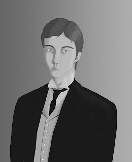
Ah . . . He gave me so much trouble in the face area . . . His hair is supposed to be red. I hope the shade of grey I used conveys that.


This one was the easiest. I don't know why . . . Maybe because it's actually a profile and not a portrait . . .
And this one didn't make it . . . I was really trying too! I busted myself over break to get the other two finished but then I just couldn't fit this one in. I'll probably finish it later though as gift art for a friend. I actually like the way her face is progressing right now too. Probably because she's the last out of the three that I worked on so all of the things I learned from the other two came together better with this one. Oh well . . .

Sunday, November 23, 2008

Progress

I've made a little progress since last time. I feel like I'm almost done with the first one and with the second but the last one has a lot left to do. It's really just tedious filling and shading but I think I'm getting a lot out of it. Expecially since I'm going for photo-realism, this is really improving those set of skills. Which was the point really.

The first two don't have the pencil lines underneath because this is what they looked like when I was working on them last. I would have taken a screen shot but I havne't figured that out yet.
http://en.wikipedia.org/wiki/Image:President_Theodore_Roosevelt,_1904.jpg The picture I'm using for lighting reference. The actual pose and clothing idea came from a different picture.

http://flickr.com/photos/cyanalab/2977724002/sizes/o/in/set-72157608409587405/ I think it's a 1920's ad or something. Very professional though.


http://www.all-art.org/history658_photography2-4.html You have to scroll all of the way to the bottom of the page for the reference photo.

Sunday, November 16, 2008

description

Haha. Forgot about the 150 words for the last post.

The way I am approaching this assignment will hopefully help me with my photoshop skills. I sketched out the picture in my sketchbook and transferred them onto the computer. The first picture that I started on was the 1920's one. Her name is Janus by the way. I thought I would start by laying down the main colors on separate layers for each thing. I kinda got frustrated doing that though and I couldn't figure out why so I moved on to the next picture. Instead of filling in the base colors on the 1900's portrait I decided to take each part one step at a time. For example, I started with the jacket because it seemed like the easiest. I filled in the base color but then went back in and did all of the shading and rendering. Then I continued to the dress shirt then the tie in the same manner. I found this a better way to work. I don't know why but it's just better for me.

I plan on starting on the third portrait soon and working through it the same way.

first update

First post for my portrait project. I would post this later and work on it some more but I don't have the power cord for my laptop.


Wednesday, November 5, 2008

2knitstitch.blogspot.com

if you want to learn how to knit.

Tuesday, November 4, 2008

You can't just delete a post on here can you? Blah


fillerfillerfiller

Sunday, October 19, 2008

Logo ad

If you read the post below, just ignore it. I opened Illustrator about half an hour ago and it decided it wanted to work. YAY! And here is the ad I created.


I think it looks rather traditional in the layout with a few twists. The only thing that is center aligned is the heading and you can't really tell because it's off to the side. For the heading I used um . . . not oldstyle but . . . modern! And for the rest I used uh . . . I want to say sans serif with a decorative style both bold and regular. The body text is left aligned with the little bars to break up the text. And as I go down the text gets smaller and smaller but I kept the bars the same size except the first one. It's not outstanding or anything but it's simple and I like the fact that it's simple.

Saturday, October 18, 2008

Illustrator hassle!

So . . . making the second part of the logo project has been a hassle. Illustrator didn't want to save because my laptop had been worked on to get some bugs out. I took it back and now Illustrator saves but the text isn't working. It was working before when it wouldn't save! I guess you win some you lose some.

I'm thinking I wont be able use Illustrator for the project even though that's the program I'm supposed to be using. The alternative is Word.

I know I could just use the computer lab but my parents are coming into town tomorrow (Sunday) and I don't even know if the lab is open on Sunday. And then, if it is, what if the building is locked? I know it locks after 5 pm on weekdays but I've never tried getting in on the weekends. If it is locked my card doesn't get the door open.

Excuses, excuses, excuses.

Complain, complain, complain.

I'll get it done. I always do.

Sunday, October 12, 2008

High School Logo part 2

The new logo for Grafton High School! I didn't use the school colors (red and blue), well, there is blue but there's no place for the red. I chose this design over the others because I like the look of it. It's straight to the point: school name, mascot name and a picture of the mascot. The other designs either weren't strong enough or the design didn't work or both. This also has a very traditional feel to it and I'm not sure if that's a good thing or a bad thing for a school this new.

I'm very proud of myself as this is my first project using Illustrator. I thought I wouldn't get it but finally today it just started coming together and I pretty much did all of this today. Except the rope, I did that a couple of days ago.

High School logo


My ninth grade high school logo. Oh goodness, I'm so happy to be redoing this thing. It's bad enough it's a boat but it looks like they didn't have enough time or money to make a proper mascot or logo for the school. I mean, it is only ten years old but still . . . I have my work cut out for me, eh?


Here's my four drafts for a new logo.


I'm partial to the first two but I've been persuaded to create the first one. We'll see how it goes!